Archives

gravatar

Zinmag Primus Blogger Template

Another fantastic addition to the collection of Blogger templates, the Zinmag Primus was originally designed by Jinsona Design and ported to blogger by Falcon Hive


.

r
The Zinmag Primus template is an update from the Zinmag Remedy had a manual click slider for the featured content this has an automated version with a start and stop button.

The template features two dropdown menus with categories and sub categories, located above and below the header section. The header section consists of the blog title and an advertisement. Under this is the feature post automatic slider and then the template is divided into the main cloumn and sidebar.

The sidebar starts off as a single column and is divided into two section later on, while the footer has four columns! The template comes with a twitter button and a tag cloud in the sidebar.

Apart from this the template lacks icons and has a sort of minimalistic design which ofcourse will help load speed, but the feel of it does not match up with the beautiful header section. I would personally tweak the design of this template a little bit before I use it. But its wonderfull no doubt, go ahead and download it!


gravatar

Zinmag Futura Blogger Template


Recently we have been featuring a lot of templates from Jinsona, who has created the Zinmag series for wordpress. Today we have the Zinmag Futura that was converted to blogger by Cahaya Biru.


If you have seen the Zinmag Remedy template that has the slider in the header that enables you to showcase your blog's posts, the Futura has this slider and goes a step ahead with another slider midway, under the featured post, in the image below the new slider is the one with the Batman image.


Lets start from the beginning, top left we can see RSS buttons to subscribe, a header title and description, the section ends with a neat search bar. Now we have a double drop down menu, and then the slider. Under the slider we move to the featured post and then comes the second slider.

After that we have a nicely created post introduction section with a readmore and comments link. The template ends with a three column footer. The sidebar starts with a tabbed navigation section, it then has a widget to pull in your twitter updates and then divides into two columns. So here we have another fantastic blogger template!

Preview


Download the Zinmag Futura Blogger Template

gravatar

Zinmag Remedy Blogspot Theme

The theme that takes blogger to the next level, Zinmag Remedy was created by Jinsona Design and ported to blogger by Falcon Hive. The hottest porters at the moment to blogspot, they have an incredible amount of templates churning out, I hope to feature all of them as and when possible.


A magazine template that will blow your mind away, the Zinmage comes with a double drop down bar, unlike The Arthemia Template for Blogger

his one works in IE6 as well. Under that is a featured post scroller that works wonderfully in all browsers I actually adapted it to my blog.

There is a featured post section on the left, its important to understand that the sections on the top and the left have to be manually created and this can take quite a bit of your time. But it sure will help in increasing your page views and boosting your seo as well.

The next thing is the big space to jot down something and the post space gives birth to a nice section that holds summarised post with the read more option. There is a tabbed navigation widget as well on the home page besides a slot for embedding videos.

The template also features two sidebars, a designed search button as well as a subscribe to feed section, RSS buttons on top and space for your blog title and description. This is definitely one of the templates I highly recommend!


gravatar

Zinmag Tribune Blogger Template

Falcon Hive is on a roll, he has converted yet another professional looking beautiful template, Zinmag Tribune Blogger template, that was originally designed by Jinsona Design.


This feature-rich newspaper-style template gives you ample of space to display your content. Zinmag Tribune, a 4 column template, has two navigation bars, the top one above the header can be used to put your contact, home, archives links etc. While the one below the header has a dropdown menu to put all your categories and sub-sections.

The header is simple with the subscribe to your feed option on the right side of the text. A useful feature on Zinmag Tribune is the content scroller, where you can place your featured content or top posts. Below it is a content glider, which is quite appealing. When you hover on the image, the headline and a small description of the post appears at the bottom, and of course your readers can glide through your latest content.

Then are four boxes to add more content and each one has the expandable post feature enabled, and after that is another mini-post section, Zinmag Tribune definitely has lot of features. The top of the sidebar has video section too, so all your favorite videos can be uploaded here.


A regular feature on many blogs is an ad section to put your sponsors or display ads. Below it comes the tabber, which makes the blog look lot neater. Then the sidebar disects into two columns, giving you a chance to experiment with your content.

That's not it, Zinmag Tribune has a bottom column which is divided into three sections. You can play around with the design, and make the maximum use of the space. If you have news-based blog, then Zinmag Tribune fits the bill.


gravatar

The Arthemia Blogger Template

One of the hottest templates for wordpress, the Arthemia template has been converted to blogger. But does it live up to its wordpress version, lets take a look at Themelib's latest port.


Well let me say this is a very neat and clean adaptation of the wordpress version, but when it comes to the functionality the wordpress theme has the blogger version gets a 3 out of 10.

The Arthemia template for wordpress is tag based, label based for you to understand, it picks up articles from select categories for you to display. It also has a prominent display of the labels incase a user wants to see that.

Its interesting especially if your visitors want to check out a particular category, it has one main post in the header and five sub feature posts. A beautiful middle bar to display your categories of choice.
The Arthemia blogspot footer
While the blogger blog
adapts the top header links, the sidebar is a single column breaking in to two parts and then finally into two. The footer is the same broken up into three columns. This template is beautiful, elegant and very professional even for blogger but as compared to its wordpress brother its far far behind.

gravatar

Tabs 01 Blogger Template


The Tabs 01 Template is an original blogspot design by Templates para Voce" that is super functional.


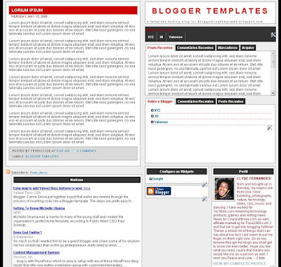
Perhaps this template is not as attractive as all the other templates on this blog. may even find it repulsive but it found a place here because of its functionality. A template like this where every section including the footer has the possibility of adding a widget is rare to find.

Its header is located on the right unlike most blogs and has a character limitation, if your blog title is really long you will find it spilling out of the section. The description is below the Blog title and then the sidebar follows.

On the left we start of with the posts, the headline, post that is the date and at the end of the post are the labels, comment links etc. The navigation menu appears on the top of the sidebar, under than are two very useful multiple template tabs.

Now the lovely part is the content in these tabs can be edited by selecting the tab and then using the quick edit icon, when you are logged in. Another great part is the templates is absolutely fluid, in the screenshot you can see one post and a box under it. As the posts increase the box automatically moves to the right if the sidebar is shorter than the main column.

Take a look at the page element layout in the screenshot below. This template will suit a blog that has loads of content, but the design is definelty something that could have been tweaked a little more.

gravatar

Related Posts for Blogger Widget for your BlogSpot Blog

show related posts for blogger A relatively easy method of increasing page views on your blog is to add a list of related posts below each article or displaying them in the SideBar. Now there is a Related Post Plugin for WordPress but there is no such one officially available for Blogger.

So here is the Solution. This offers readers a ready-made reading list of other articles on your blog, which are of a similar theme or subject matter.

Installing Related Posts for Blogger Widget for your BlogSpot Blog

Installation

Option 1 - Add Related Posts Widget to Sidebar

Step 1. Click the button below


Step 2. Move the new sidebar widget to a position you like


The new sidebar widget will be created at top of your sidebar, you may want to move it a better place. Remember to save.

Tip: You actually can drag this sidebar widget and drop onto after Blog Posts widget, then this widget will show up after comments.

Step 3. Go to one of your blog post


You have to see it in action in single post, you will not see the Related Posts list in your home page of your blog. Just randomly choose one of your blog post.

Option 2 - Add Related Posts just below your Post Content


Step 1. Go to Layout/Edit HTML/Edit Template


Step 2. BACKUP your template! Do not skip this!


Step 3. Check Expand Widget Templates, then Find a block like:


Step 4. Add one more line to be:


Step 5. Go to the end for:


Step 6. Add two more lines to be:


Sponsor Ads

Who's Online